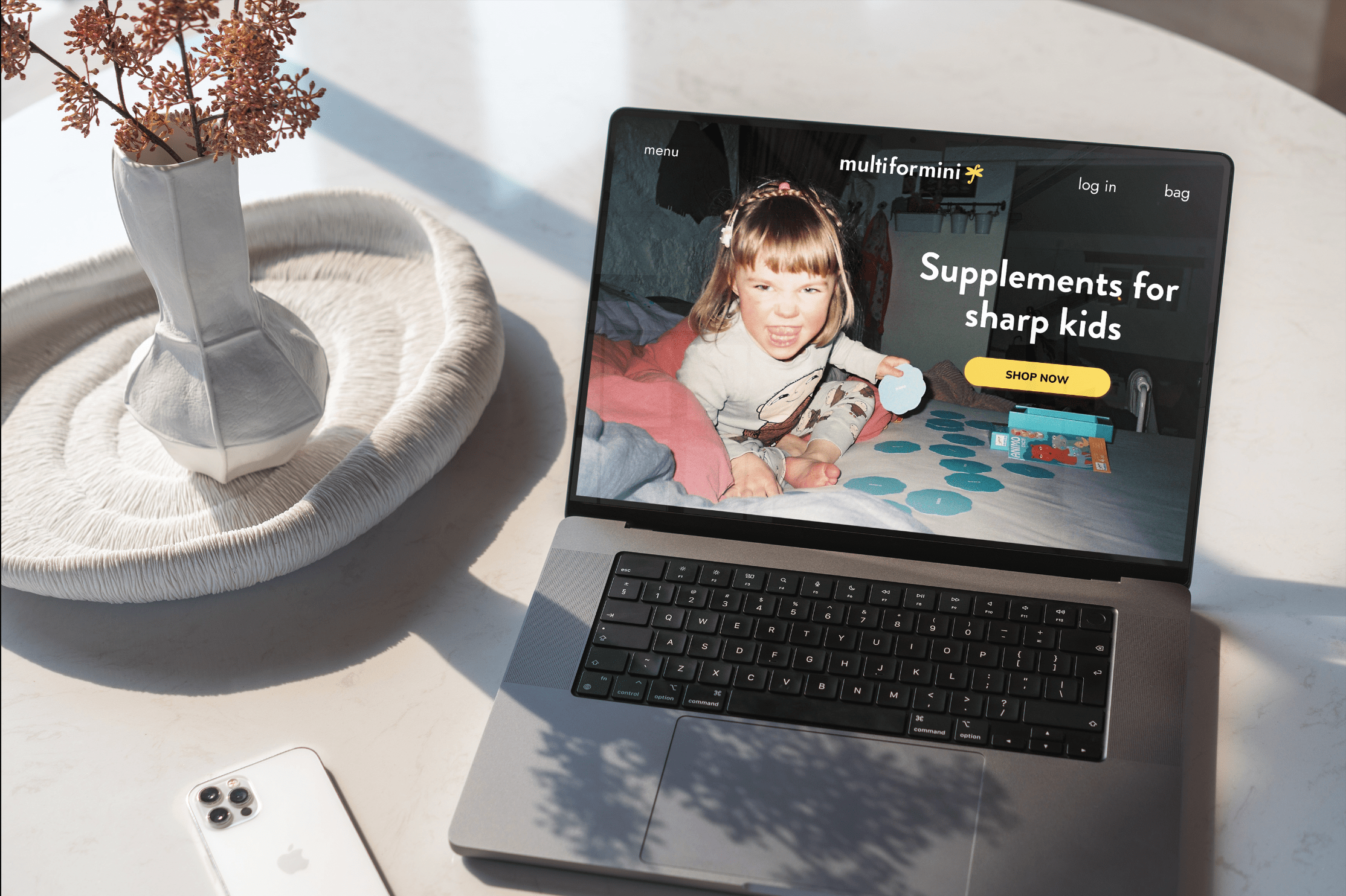
The idea for Multi for Mini came from a photograph I once took of my daughter as a toddler—reading a book to my ex’s dog, wearing a bikini. There was something so genuine in that moment—the way kids imagine, play, and stay curious about everything. That spirit became the foundation for an imaginary children’s multivitamin brand.
Multi for Mini celebrates the uninhibited side of being a kid. It’s built on the belief that exploration is essential to growth—that children need freedom, curiosity, and joy to truly thrive.
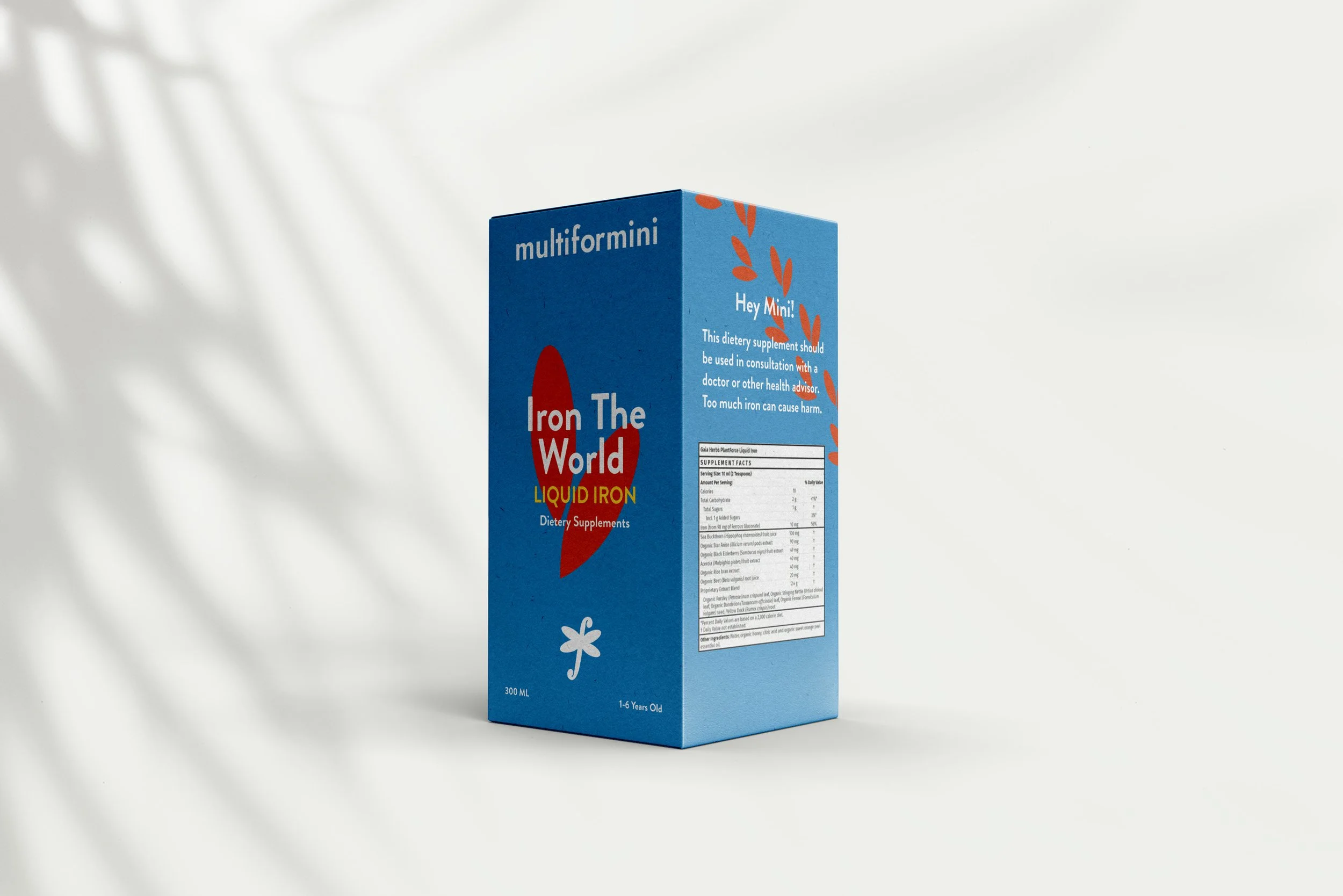
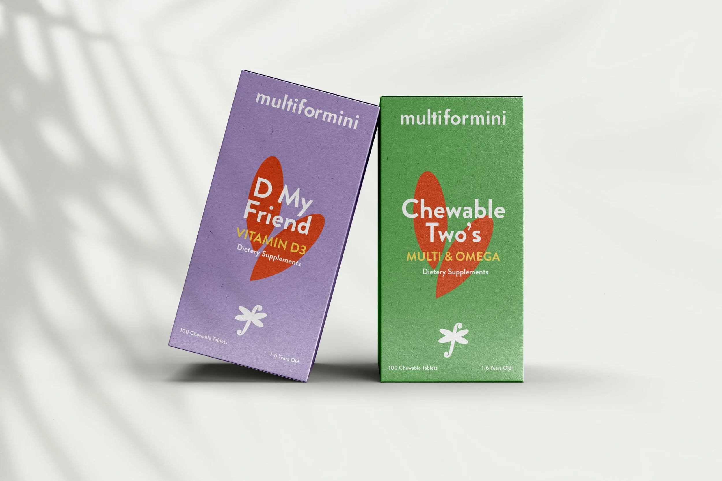
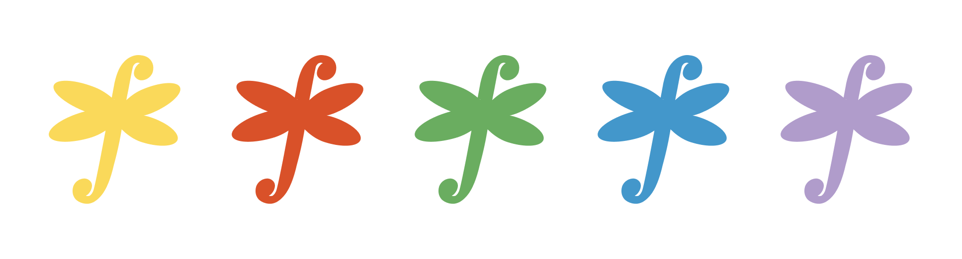
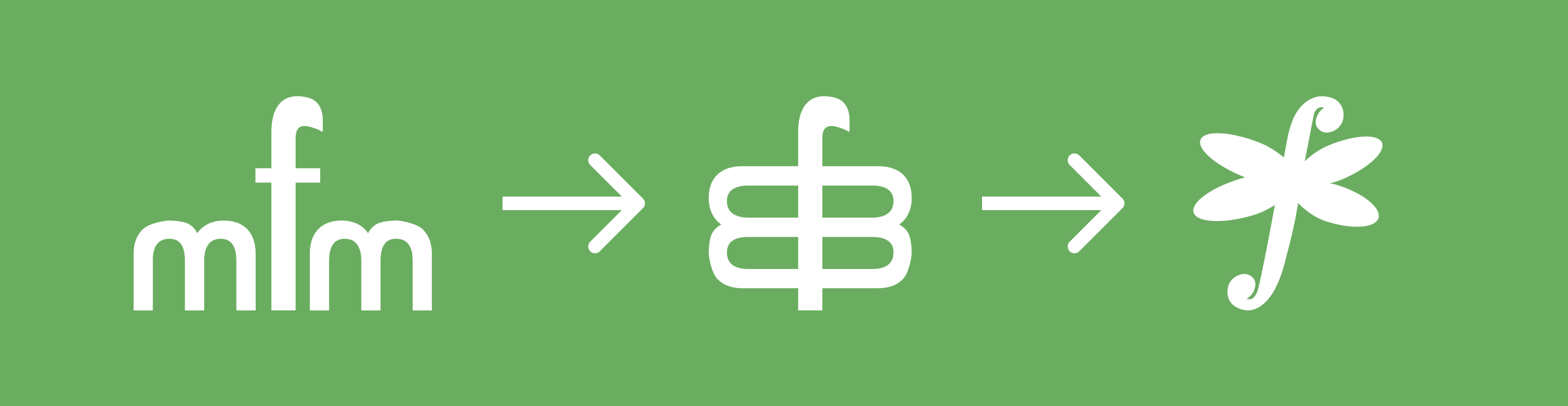
The identity reflects this with bold, vibrant colours, chosen to symbolise strong characters and lively personalities. The logo itself is crafted from the initials MFM. When combined, the letters transform into a butterfly-like shape, evoking a sense of lightness, play, and possibility. The red elements resemble hearts or tiny footprints—symbols of love, growth, and the small but meaningful steps that shape a child’s path to adulthood.